Menu
Five projects, five brilliant designs. When it comes to a period Victorian property, there’s more potential for innovation and originality across the ground floor than you may imagine, says Georgina Blaskey
Deciding to extend and reconfigure the ground floor of your home is a hugely exciting prospect and one with more scope than you may at first realise. These days, pushing out to your garden wall via a side return is standard practice for maximum width, but how you design the rest of the ground floor is far from prescriptive.
At the back of the house, the flat fourth wall in glass is still the most common upgrade – and with good reason – but experimenting with angles and spaces to create an unusual, design-led feature is growing in popularity and allowing architects to flex their creative muscles.
As the family gravitates towards the back of the house, what happens to the former ‘front room’? Check out our five design solutions to ensure the entire ground floor is well used for family living.
Obviously budget is a key factor here, and Plus Rooms has a handy calculator on its website to help you cost up your plans (plusrooms.co.uk/estimated-costs/) but you can expect to pay from £50,000 for the most basic ground floor extension (including building work, plumbing, electricity, glazing and external doors, and applicable VAT).
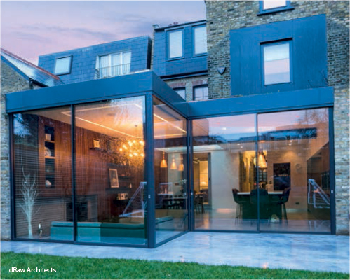
All original areas of the property reflect the original proportions but the new extension isn’t intended to blend in to the rest of the house. It is meant to feel like a new part and there is a deliberately clean line between old and new.
The original double reception room can be opened up so there is the potential to have one big space. But you can also partition off rooms using doors, so the entire ground floor can be an open flowing space or it can be three separate rooms.
The design itself maximises space. We discovered an old foundation beyond the existing walls at the rear, which meant we could go further out within the confines of permitted development. Sometimes maximising space isn’t just about design, it’s about knowing the grey areas!
Just because it’s open-plan doesn’t mean it can’t be zoned. Within the new extension are three distinct areas – the modern, selfcontained Bulthaup kitchen, the dining area (the glass above announces it as its own space), and the sunken area, which is cosy and feels like you’re in a compact space. By being sunken, it means you don’t see the back of furniture towards the garden; it gives you better sight lines.
Large spaces can be cold and uninteresting. The wood on the walls grounds the scheme and warms it aesthetically; its vertical lines lift the space. There should never be any real wall space in this kind of design, it can lead to tedium in the area. On these four walls there is kitchen, glass, joinery and then two openings to the rest of the house. It feels luxurious as a result. Often in Victorian properties, people tend to cram the space. I like to let it breathe. It’s better.
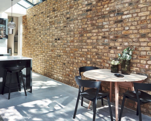
The layout of this house has essentially remained the same but the materials used have been updated, complementing the original features. For this project the architect specified Crittall doors and partitions, and internal brick walls. The change in level on the ground floor also keeps the traditional character.
The use of glazed panels throughout the ground floor opens up the space creating sight lines to the furthest point, so the space feels connected. The storage is re-designed to create a modern space that is liveable, as everything has its place. Modern design concentrates the space needed for items. The clients entertain regularly and they wanted to give that middle room a real function so it’s a dining room with an integrated bar. The second living room is often overlooked, and the dining table overtakes the kitchen area.
In this instance we have used a casual dining table in the rear extension for day-to-day dining. The extension is very modern. This was achieved by purchasing new furniture for the extension and upgrading the furniture in the existing ground floor so that it all works together. We also used the same colour palette throughout.
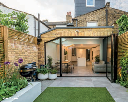
We have tried to be sympathetic in our use of materials as well as in our design to ensure the new extension sits well with the character of the original property. The choice of brickwork and tiles ensured we maintained the tones and textures, for example the dark grey tiles and aluminium cladding match the colour of the existing roof.
The angle on the pitch down the side return helps to break up and soften the overall design and offers nice light reach through the glass, angled into the darker original zones. The angle of the roof has been accentuated by the angled fixed glass panel adjacent to the folding doors at the rear, again offering a twist on the more standard rectangular rear openings. The benefit of doing this is not only in the aesthetics of the design, but also in maximising the glass and light at the rear and helping to create more connection and aspect with the garden. The predominant glass backdrop to the extension highlights this even when the doors are closed and makes the space feel bigger.
Traditional front spaces often struggle for light and have limited, if any, view. This rear space has the opportunity to connect with the outside through aspect and to bring lots of light into the space. Living spaces thrive on being open and bright, so by combining the kitchen/living/dining area we take full advantage of the benefits that this plan brings.
The garden really does feel like it is part of the house with this design, even when the folding doors are closed. This feel has been achieved by maintaining the same floor levels and floor covering from inside to out, as well as having maximum glazing. A similar flow is achieved with the interior and exterior boundary walls, allowing a seamless run from inside to out.
At the front of the house the entrance hall, front room, staircase and hall to the rear have been left intact and so the proportions of these spaces remain the same as when the house was originally built. The heritage and authenticity of the house are retained, though aspects have been given a modern twist, such as painting the stair spindles in a darker shade. This property also benefits from a wide and open entrance hallway with original tiling. By retaining small details, such as the original tiled flooring and the wooden handrail to the staircase, one is physically connected to the original features of this house.
Having completely open-plan ground floor spaces might make homes feel larger and lighter, but they present owners with practical challenges when it comes to actually living in them – not everyone wants to be together all the time! This property benefits from a combined living/dining/cooking zone at the rear of the house, which is modern and contemporary in feel.
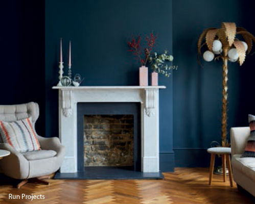
This is where the owners spend the vast majority of their time. The front reception room feels a very modern and contemporary space but it successfully retains a sense of tradition. This is achieved through the fireplace, the parquet flooring and the windows, which are all either original or a nod to the original character of the house.
By having the kitchen set back slightly from the rear of the house the owners can enjoy a wide and open living space, which connects directly to their garden. The kitchen is still at the heart of this living zone but it does not dominate the space. The glazing has been maximised in both height and width to allow for maximum light and connection to the garden. The living zone spans the full width of the house whilst the kitchen sits in what might be regarded as the most awkward space.
The modern and traditional aspects work wonderfully well together and blend seamlessly. Visually and physically nothing jars in this space – an original tiled floor flows into poured concrete; the traditional front reception room is in a bold blue paint while the modern extension has an air of calm through its simple choice of finishes.
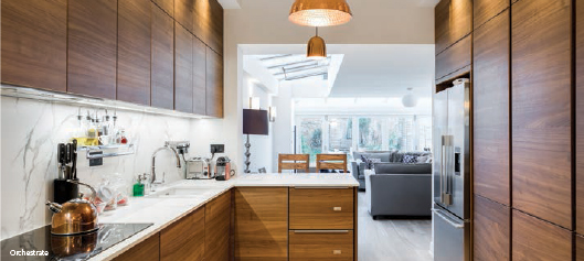
This broken-plan design cleverly divides up the ground floor into very distinctive zones while keeping a strong feeling of connection. By putting the dining room in the naturally smaller space at the front of the house, and the kitchen running between, the larger, wider extension can be dedicated entirely to family living space. If you have young children, this space can easily adapt and develop as they become older.
The dining room can become a multi-functioning room without dominating the ground floor; for example, a quiet space for homework or, with its direct access to the kitchen, a great space for entertaining. This layout has all the benefits of openplan as it feels spacious, light and bright, and it’s a very sociable environment, while retaining a sense of privacy with its divides. There is no wasted space, but there are definite distinctions between where you cook, relax and entertain.
While working on this extension and refurbishment we made sure that we did not remove anything unnecessary and that our team took special care not to damage any original features. We installed classic period design elements, such as cornicing and skirting that were in keeping with the original Victorian ones, and carefully restored what was already there, such as the front door and the architraves, meaning the whole house flows and feels connected.
• Trust your instincts – choose a colour that you are both comfortable with and love
• Complementary colours are great for enthusiasts of bold colours; neutral décor devotees can choose classical whites
• Coloured shutters can be the accent in the room or can lift interiors when painted in white hues
• Choose bigger louvers for large window panels or if you like more light
• For bedrooms – especially for children – combine shutters with a blackout roller blind attached discreetly inside the frame
• For front rooms on street level, consider café-style installation for privacy whilst letting in daylight from the top tier
• Solid panel and louvered shutters with tilt rods are ideal for period properties; for contemporary interiors look for styles without the rod or moulding details on the stiles
• Consider finishing touches such as the colour and finish of hinges, tilt rods and mechanisms
• Think about the environment – choose a provider that uses sustainable wood sources
Source: The Traditional Shutter Company
Doors, along with many other aspects of a house, are an important feature which deserve care and attention. The right style of door can make all the difference to transforming your home.
Whether you go for handcrafted wooden doors which are perfect for period style homes, or slim aluminium doors for modern designs, you will use them daily. Most people will take care when planning their kitchen or living room design, and doors are a key component. Visiting a local showroom where you can see and use the doors to get a feel for them is advised, rather than just making quick decisions based on price and photographs.
For doors that will be used in everyday life, you want to make sure they will not only last but give you years of hassle-free operation and pleasure each time you look at them.
Source: Cedar Bifold Company